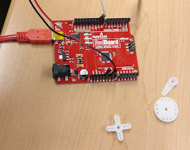
Paper prototypes were interesting in that we could easily implement a design. But it posed its own challenge in the ways that we could use paper to communicate the design. At times, our solutions were limited by the materials we had on hand. Screen interactions today aren’t just visual experiences, they are tactile as well. But those experiences are even harder to communicate on paper and require a lot of manual set up to fit into the study.
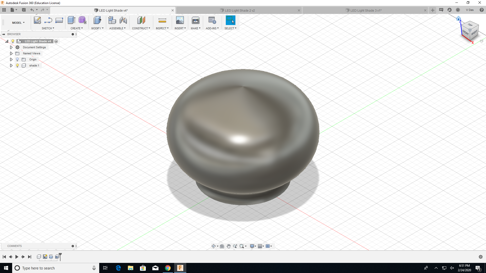
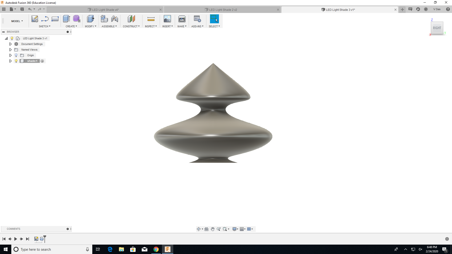
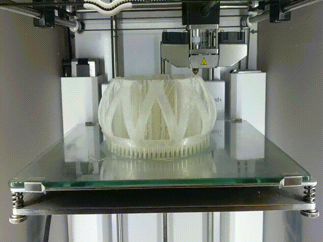
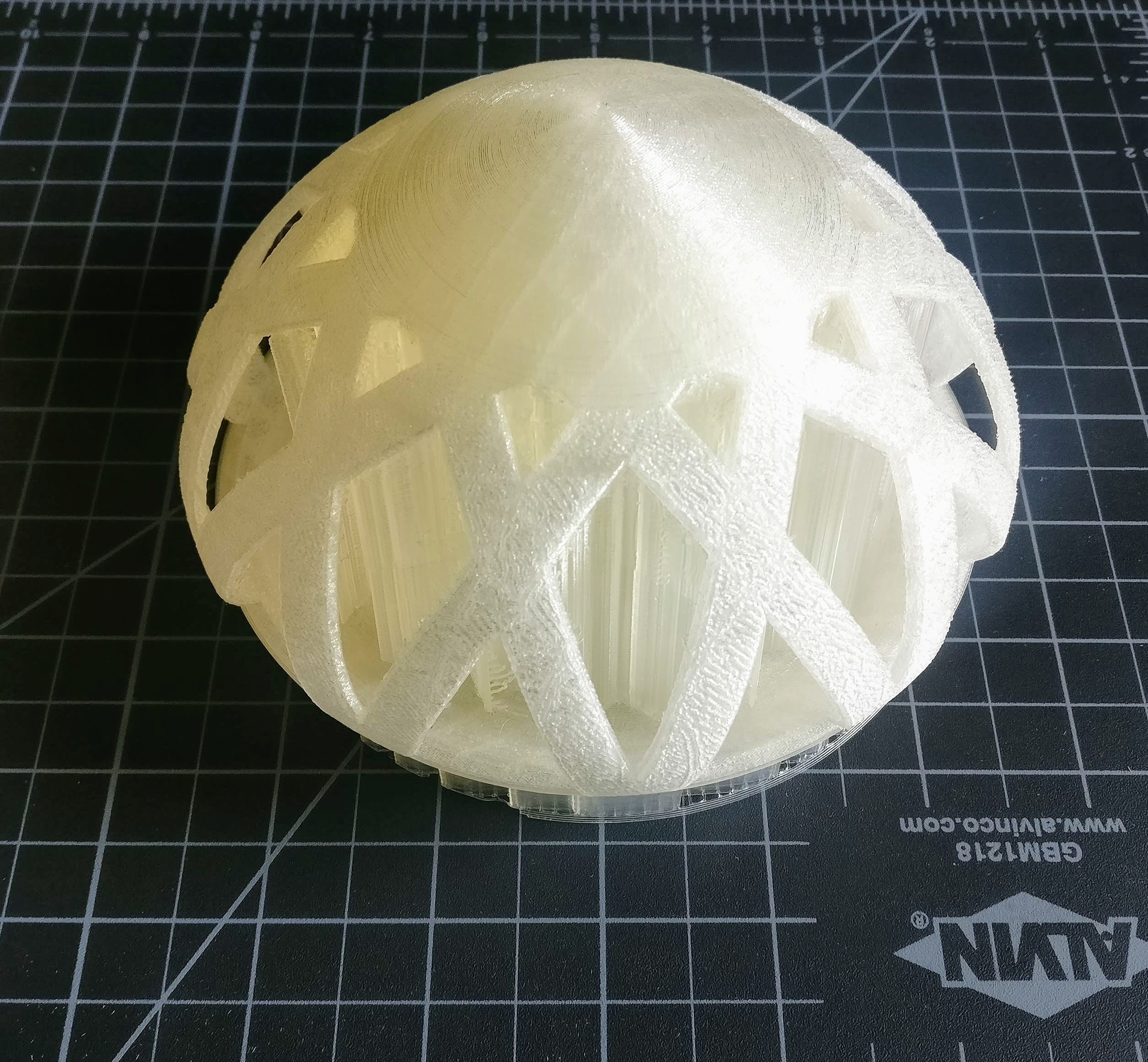
Making
The alarm displays three main functions upfront which are- the alarm ring time, options to Cancel and Snooze.
The blue alarm icon at the bottom indicates to the user that they can perform a swipe in both the directions to either cancel or snooze.
When swiped to snooze, the user can choose predefined snooze time or add a custom time.
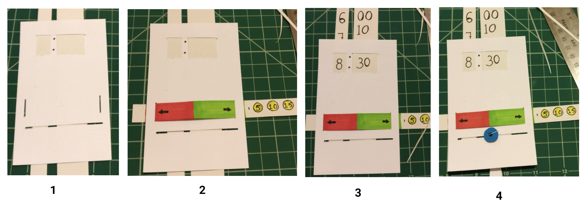
The prototype clearly indicates through the usage of arrows and the primary colors of red and green that a swipe can be performed.
When asked to dismiss the alarm, through the affordance of the blue alarm icon and the small slice of horizontal spacing, the user can easily recognize the desired interaction which is a swipe in the direction indicated by the red area. To achieve the snooze interaction, the user could swipe right which forms way to the predefined and custom time options. The user could choose 5, 10, 15, 30 or the input circle to insert the desired snooze time by the tap/press interaction.
Pilot Study and Usability Tests
Goals
Which snooze interaction is more intuitive?
Which snooze interaction works better for a “sleepy”/”groggy” state?
What balance of visuals/haptics are required to signal to the user the right action?
Script
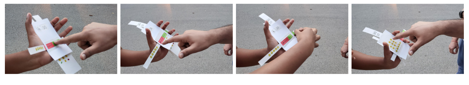
This is a paper prototype. In this test, we will ask you to interact with the paper as if it were the screen of your phone. We will give you a set of tasks and ask you to demonstrate how you might accomplish those tasks. Occasionally, we will prompt you for your thoughts.
Tasks
1. Imagine you’ve set your alarm. You wake up before it goes off. 2. 2. How would you cancel your alarm?
3. Imagine you’re sleeping. The alarm goes off. How do you dismiss the alarm?
Alternatively, how do you snooze the alarm?How would you snooze the alarm for a specific time?Imagine you’ve set your alarm to snooze. But you’re awake now. How would you cancel the snooze?
Feedback - Although there were arrows and colors to differentiate the functions of snooze and dismiss, the participant was confused on which direction is which.
Modification - I added labels indicating Snooze and Cancel which provided more clarity.
Feedback - After the participant successfully performed a swipe, she expected similar interaction with choosing the predefined snooze time. She tried to use the blue icon to interact which was not the desired outcome.
Modification - I removed the blue icon so the participant can choose the next best form of interaction communicated by the prototype which is a tap or press.
Feedback - Although there were arrows and colors to differentiate the functions of snooze and dismiss, the participant was confused on which direction is which.
Modification - I added labels indicating Snooze and Cancel which provided more clarity.
Iterations
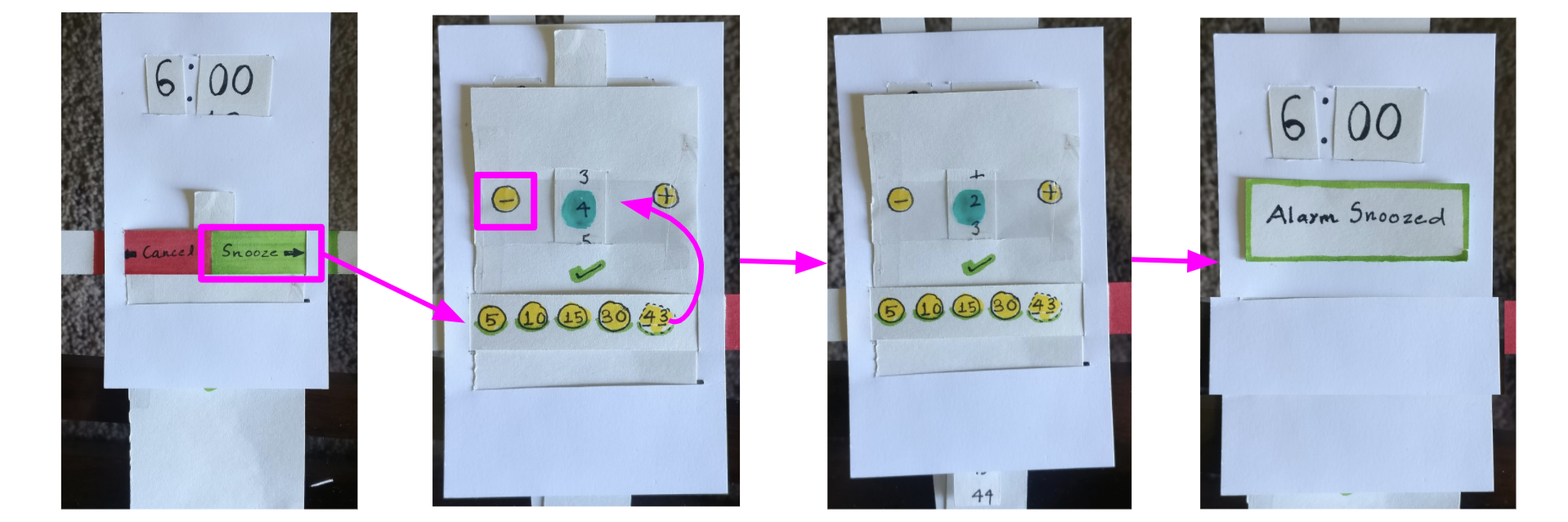
Overall, Prototype seemed a success.
Usability Test 1: The user was able to complete the tasks with little confusion.
Usability Test 2: The user experienced some confusion with the custom snooze time task. The intended interaction was to press the + button multiple times. But because of the presence of the vertical strip, she mistook the interaction as one with scrolling feature. This does not conflict with the prototype and can be added to the design.
Test/Prototype Challenges:
- As suspected, the subject required some further scenario-building to communicate the digital feedback that paper effectively could not communicate.
- The challenge of communicating digital feedback affected the user’s ability to perceive the right interaction. But once it was expressed, it was a easy learning curve.
- The user seemed to like the compactness of the prototype. But, the user struggled with the swiping function and thought the arrow could be more pronounced.
- Given the way we presented the “Alarm Snoozed” button, the user seemed to think of it as a button of confirmation rather than a new screen with the button as a notification.
.png)
.gif)
.png)